Monday, November 16, 2009
Wednesday, May 6, 2009
FINAL PROJECT
This is my final project. The task was to map the known prehistoric monuments in Scotland. Not easy for many reasons:
- the monuments are known by many names, many in Gaelic so looking up information on them in daunting and takes forever
- very few of them are well documented, most sources just list speculations and measurments
- The British don't seem to be in a hurry to excavate these, after all, they've been standing there for thousands of year
- prehistoric = no written history so speculations are all there is
Mapping these monuments was not horribly difficult. I spent (too) much time on the visual side of the map and did not pay attention to what I was doing. So I had to go back and change the buttons after making them bright red the first time, now they look much better (thanks for the suggestion Professor Hallden!!). In the end I had some extra time so I added some labels for the oceans etc. Overall I'm happy the way this turned out and would like to research more into these monuments.
Wednesday, April 15, 2009
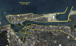
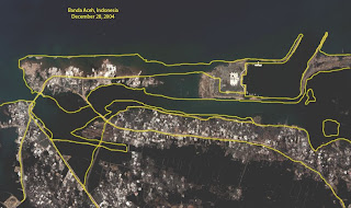
Boxing Day Tsunami (Lab 10)
This lab shows the devastation of the tsunami produced by a big earthquake in December, 2004. Almost a quarter of a million people were killed.. One of these satellite images were taken in June 23, 2004 and the other, following the tsunami, in December 28, 2004. The lab itself was interesting, Photoshop is a great tool.


Thursday, April 9, 2009
Cartogram
Lab 9
Here is my Lab #9. Why on earth is Sandy Creek parking lot located in Boulder, Colorado? :-D I really have no idea how it ended up there and there didn't seem to be a way to move it around either.
This was a fun lab, the drawing part was easy and I can see how it could get really challenging if you were to draw something in more detail.
This was a fun lab, the drawing part was easy and I can see how it could get really challenging if you were to draw something in more detail.
Wednesday, April 1, 2009
Monday, March 30, 2009
Presentation: Hillshading and Draping
Hillshading and draping are tools that take a map to a whole new level. Hillshading makes the map look three dimensional and can be useful when identifying certain objects, such as river valleys and lowland areas, on a map. Draping means literally draping an image, such as a satellite image, over a terrain. Here are some examples of both tools.
This is a nice example of hillshading of the San Francisco Bay Area. If you look at a regular map of the same area, you might wonder why the bigger population centers are located in certain places. But when you see this map, you can tell how the topographic setting of the area affects where towns are located at. If you zoom close enough, you can tell that major roads are located in either valleys or on relatively flat ground.
This example map of Mile Creek Natural Area in Ithaca, New York shows a hillshaded map from an interesting angle. Digital raster graphics are combined with hillshading based on DEM. It is nice to see the effect of the contour lines, how the cartographer didn't get rid of them but chose to keep them in the map.
Here is a nice black and white map of the Easter Island from the Australian National University. This shows how effective hillshading can be even without the use of color.
This is a geological map draped over a topographic map. Combining geological data with the elevation makes sense since you can distinguish the different geological "categories" (sorry, I have no background in geology) and where they are located in the topographical setting.
A satellite image, such as Landsat image in this map can be draped over a digital elevation model. The nice thing about this map is that the way it is displayed, it looks more three dimensional than draping the same image over a "flat" map.
My last example is perhaps the most dramatic one of what draping can do. This is another Landsat image draped over a topographic map (from NASA's Shuttle Radar Topography Mission). It displays a part of Southern California. This map is perhaps the most life-like and illustrates the difference between elevations.
Wednesday, March 25, 2009
Lab 7
Whew!! Operation Barbarossa finished. Was it a success? Not for the Germans but for the one Finn who wanted to map it - YES!! What I really like about my map is:
1) it's DONE!!
2) the pop-ups are pretty neat and (in my opinion) easy to read
3) the colors are nice, although I haven't taken the time to figure out how to post the map without the browser background changing as well
4) the basemap is nice, it took forever to do but I'm very happy with the result!
5) did I mention it's DONE?? Well it is! And I cannot believe it!
Sure there are some things that are not so perfect but who cares. I'll try to work on the shape tween a bit when I have the time (?!?) and there is a tiny shift in the basemap in the last frame I couldn't quite figure out how to fix. Oh details..
"Drawing" this map gave me some ideas for my final project. I wasn't sure how to do this one thing but figured it out and now I know how to take it a step or two further in the final project.
Wednesday, March 18, 2009
Wild fire progression in San Diego
This was a pretty neat map I found on the internet. Not the first one on the page, you'll have to scroll down to the other ones. The maps are 3D and I think they've done a great job showing the terrain of the area and how the fires spread. The maps have lots of potential (it would be great if the user could control the timeline, for example).
Lab5.. Take two
So I know we're supposed to post lab 6 by now but surprise! I'm still in lab 5. Had some major difficulties with the buttons and wasn't paying enough attention so the map shifts a little in the last frame of the movie. But anyway, this is it so far.
The buttons still don't work like they're supposed to. What's really weird is that you can only choose the date buttons (such as August25) when the movie is stopped in the beginning and not while the movie is playing.
I've been working on this map on a 20" screen and when I'm trying to load it up on a 17" screen it is just too big. :(
Something positive about the map? I actually like the basemap. It took a loooong time to "re-draw" all the country boundaries and I wish I had changed it to represent what Europe looked like in 1941. I like my caret and I think the flags are good representations of German troops.
Off to lab #6..
Wednesday, March 4, 2009
lab5..
Yikes. Something is wrong with my timeline. So I ended up doing only one army unit for now to because I think it moves waaaaaay too slow. I used 10 frames to represent a day. Anyway, here is my "lab" or what I've done so far. No controls or timeline, just a box moving across the screen. I want to change the symbols to tanks (for the tank units) and really get the timeline right. Sorry for the horrible lab, I'll work on it during the break.
Wednesday, February 25, 2009
Immigration to the United States Map
I found this map interesting. In a way it works like the map we did this week, although the checkboxes are a bit different.
Monday, February 23, 2009
Lab #4
Here is my fourth lab. It was fun but long. I don't quite like the fact that when it first loads up, you have to uncheck all the boxes to get an empty map. And I can't figure out what I did wrong! Overall this lab took a long time to do and was sometimes pretty frustrating.
I chose Republican party and wanted to do a more historical map for a learning experience.
Monday, February 16, 2009
GMU interactive map
I really like this map of the Fairfax campus. It has made my life so much easier this semester! The red color is very effective on the otherwise green map and it's nice that you can click on most of the buildings. They even put the clock and the George Mason statue in there!
Lab #3
Woohoo! This LAB is finished already and I'm pretty happy with it! Downloaded the 30-day trial from Adobe so I was finally able to work on this from home. Changed the colors and fixed some weird things from the previous version. Used only one sound for all the functions, the beep was my favorite. This lab was actually fun! And no, I'm not being sarcastic. I finally figured out how to use Flash.. That helped quite a bit! Though I'm still figuring out the drawing stuff, I learned how to have round edges on a box but then couldn't do it again. Hmm.. Anyway, I think I'm missing a game but noticed that only in the end. Another great side to this lab? Now I know something (just a teeny tiny bit) about football.
Wednesday, February 11, 2009
Lab#2
So here is my second lab. I ran out of time (as always) so the graphics stink. Figuring out how to use Flash and add buttons etc. took so long that I did not have time to concentrate on the colors and other visuals. Oh well, at least it works! I had an extra timeframe in the end so I ended up doing "the end". Could've just deleted it but... Uploading to my mason web page was easy once I located the password I used for uploading stuff a year ago. Maybe I'll work on this some more if I ever find the time.
Wednesday, February 4, 2009
Simple Map Animation
I found this simple map animation online. It keep replaying itself and is very simple in its graphics. I guess it would be more like a flip book. The idea is interesting and could be developed into a more complicated animation.
Thursday, January 29, 2009
Lab #1
Thursday, January 22, 2009
New Semester!!
I found this interactive map of the 2009 inauguration interesting (you might have to scroll down the page a little bit to see it). It displays the Mall area of DC, showing the parade route and different events. You can choose what information is displayed by clicking on icons. You can also zoom in and out of the map.
Subscribe to:
Comments (Atom)


